Building a seasonal veg app with Eleventy. Part 2 - Styling
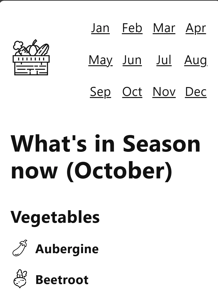
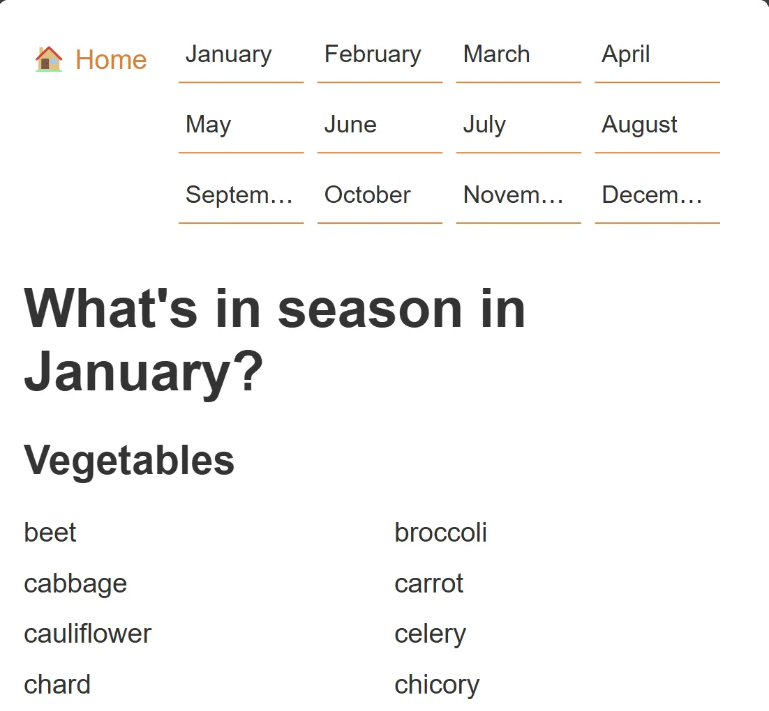
I didn't have a plan on how I wanted to style this app before starting this. I didn't want to outright copy seasonal.today's, even though I really liked how simple and clean it was, and how nicely laid out the navigation was on mobile device (grid layout on the top right; easy to press with a thumb) and how the lists were laid out in columns. I wanted my own flavour. But I've never really been good at web design from scratch, so I'm going to wing it.

For now I added some simple styling with CSS without thinking too much into it, as a first version. I thought having a preprocessor like SCSS was a little overkill for such a small project, although not being able to define media query breakpoints in one place is getting messy.

I decided to go with an orange colour scheme... because the Netherlands... and carrots? No logo yet, but I'll leave that till last as a final detail to improve.
Also, I'm still getting used to using Nunjucks. It's quite nice, but bouncing between Markdown and Nunjucks files gets confusing and so I keep accidentally making syntax mistakes 😅